

| Online: | |
| Visits: | |
| Stories: |

| Story Views | |
| Now: | |
| Last Hour: | |
| Last 24 Hours: | |
| Total: | |
Housing Bubble 2 — in One Chart


Now the gap between real house prices and real earnings is even wider than it was in Housing Bubble 1.
We know two things about housing bubbles: they always pop, with devastating consequences, and apologists and pundits always deny housing is in a bubble. And so it is no surprise that here we are in Housing Bubble 2, the second housing bubble of the 21st century, and the usual suspects are denying housing is in a bubble.
Courtesy of longtime correspondent B.C., we have a chart that not only identifies housing bubbles but explains why they inevitably collapse.
I know this will come as a great shock to apologists and pundits who have never seen a bubble until it has imploded, but the income of buyers actually matters in housing.
We have become so accustomed to housing being propped up with 3% down-payment FHA loans, foreign buyers paying with cash and Fed-favored financiers buying 10,000 homes to rent to former homeowners that we tend to forget that in the longer term, housing sales depend on buyers with enough income to pay the mortgage, property taxes, repairs, etc.
This chart reveals the tight correlation between real (i.e. adjusted for inflation) new house sales prices and real wages/salaries. Every time house prices get ahead of earnings, house prices decline sharply. Since these are real prices/wages, they go down when prices/wages don’t keep up with inflation. So while nominal house prices didn’t sag much in the late 1960s as inflation took off, they fell sharply when adjusted for inflation.
House prices fell again in the late 1970s when they briefly exceeded the growth of earnings.
An extended period of housing prices soaring above earnings in the late 1980s was followed by a slump in housing in the early-to-mid 1990s.
Housing (black line) is relatively cheap when it is well below earnings (red line). Housing was an attractive buy in 1970, 1982 and the mid-1990s, when earnings rose in the dot-com era.
Housing Bubble 1 is clearly visible as house prices skyrocketed far above earnings in the 2004-2008 period. The gap between house prices and earnings widened to an unprecedented degree, and this extreme resulted in an equally unprecedented crash in housing valuations.
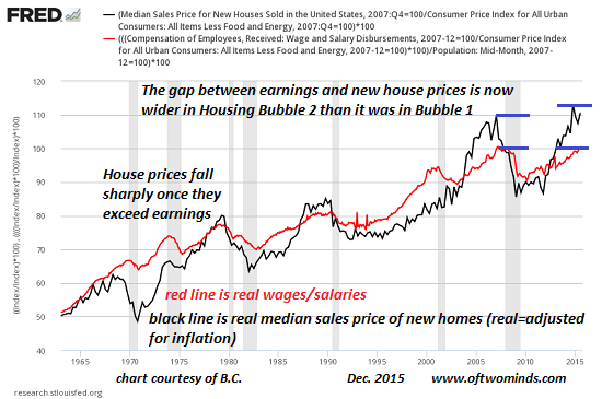
Now the gap between real house prices and real earnings is even wider than it was in Housing Bubble 1. History (and common sense) suggest that housing prices will once again fall sharply until the black line of house prices is well below the red line of real earnings.
To expect anything different is unrealistic and highly dangerous to one’s financial well-being.
Delivered by The Daily Sheeple
We encourage you to share and republish our reports, analyses, breaking news and videos (Click for details).
Contributed by Charles Hugh Smith of Of Two Minds.
Source: http://www.thedailysheeple.com/housing-bubble-2-in-one-chart_122015
