


| Story Views | |
| Now: | |
| Last Hour: | |
| Last 24 Hours: | |
| Total: | |
Comparison of Gini ratios for various household sizes: 1998 vs. 2007.

In the previous post, we presented the difference in income distributions for household sizes from one person to seven and more people as observed in 1994 and 2007. Unfortunately, there are no Gini ratio estimates in 1994 for specific household sizes. The first year when the Census Bureau reported these estimates was 1998 and here we compare Gini ratios for 1998 and 2007 together with now standard presentations of normalized income distributions. We use 2007 because in 2009 the CB changed the width of income bins to $5000 and increased the high-end limit to $200,000. Therefore, the measurements before and after 2008 are not compatible. Since nominal GDP was higher in 2007 than in 2008 it is reasonable to use 2007 as a reference year.
Again, we do not repeat the technical part which was well described in this post. Briefly, we showed that the household Gini is biased up in 2007 relative to 1994 because the portion of smaller and thus lower income households increased. Accordingly, the average size decreased. To do this, we normalized the household income distribution to the total number of households and corrected the income bins to the total increase in nominal GDP and the change in the total number of households. This operation is similar to that used for the Lorenz curve calculation.
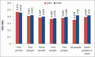
Figure 1. Comparison of Gini ratios in various household sizes: 1998 vs. 2007.
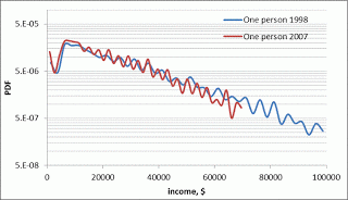
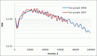
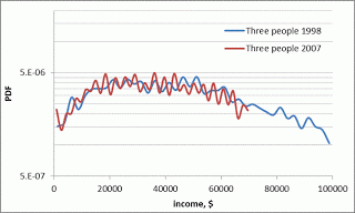
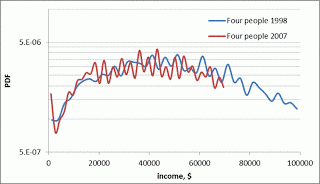
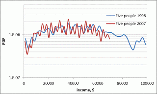
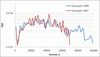
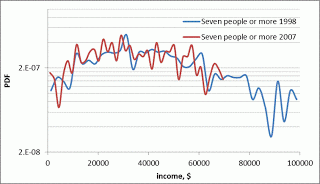
Figure 2. The evolution of income distribution density functions in various household sizes.
2012-09-28 10:11:39
Source: http://mechonomic.blogspot.com/2012/09/comparison-of-gini-ratios-for-various.html
Source:
