
| Online: | |
| Visits: | |
| Stories: |

| Story Views | |
| Now: | |
| Last Hour: | |
| Last 24 Hours: | |
| Total: | |
Gasoline Prices, Minimum Wage Hikes Define Trends for California's New Jobless Claims
Last week, we used a well established method of statistical analysis to demonstrate that layoffs were beginning to spread to the states outside of the eight oil-patch states where they had previously been concentrated.
Today, we're digging into that discovery to see if we can identify the factors that are driving the statistical break in what had been a steady trend of improvement that had become established in July 2014.
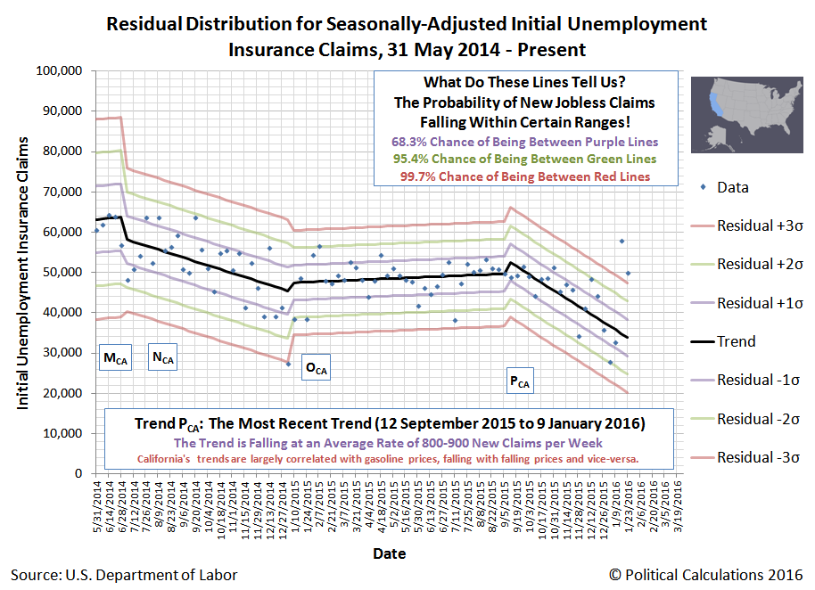
Our first step is to look at the state with the biggest population of the states: California. The chart below shows the state's residual distribution of the major trends in new jobless claims filed each week from 31 May 2014 through 23 January 2016, adjusted for seasonality using the BLS' national-level seasonal adjustment factors. (Since California represents the home of one out of every eight Americans, we will assume reasonably approximates the seasonal adjustment factors that would more accurately apply to that single state's economy.)
In the chart above, we identify four main trends for new jobless claims in the state of California during the period of time since 31 May 2014.
- Trend MCA: Coincides with the national trend that began on 23 February 2013, which extended through 28 June 2014. Nationally, the trend was defined by a general improving trend of declining layoffs and new jobless claims, which fell at an average rate of 460 per week. In California however, the trend of new jobless claims was characterized by a volatile but steady increase of 130 per week.
- Trend NCA: Oil prices, which began falling in late June 2014, prompt a reversal in California's fortunes with respect to new jobless claims. From 5 July 2014 through 3 January 2015, California's new jobless claims would fall at an average pace of 486 per week. We should note that California also increased its minimum wage by $1.00 per hour, effective 1 July 2014, to $8.00 per hour right at the beginning of this change in trend.
- Trend OCA: After months of falling oil and gasoline prices, they bottom in January 2015 and begin to rebound – peaking in July 2015. New jobless claims in California also rebound in this period, rising at an average rate of 64 per week. This flat-to-upward trend for new jobless claims extends past the end of rising oil and gasoline prices, coming to an end by 5 September 2015.
- Trend PCA: Weeks after oil and gasoline prices begin falling again, new jobless claims in California begin falling at a steep rate, with the average pace of initial unemployment insurance claims filed each week plummeting by 984 per week – more than double the rate seen when oil and gasoline prices fell by a similar amount back during Trend NCA. The trend however appears to have come to a sudden end in January 2016.
Why such a difference between Trend PCA and Trend NCA? Unlike July 2014, we observe that California didn't increase its minimum wage in this period of falling oil and gasoline prices, which meant that businesses in the state, particularly those related to the fuel price-sensitive food, accommodation, travel and recreation industries, benefited from the increase in the disposable income of Californians without having their costs of doing business arbitrarily increased – allowing them to both put and keep more employees on their payroll to keep up with the improved economic situation.
That changed however on 1 January 2016, as California increased its minimum wage once again by $1.00 per hour, to its current level of $9.00 per hour.
We've previously observed that new jobless claims lag some 2 to 3 weeks behind the events that drive changes in the hiring and employee retention decisions of U.S. businesses, which corresponds to the typical weekly and biweekly payroll period that predominates throughout the U.S.
In the chart above, the sudden appearance of extreme statistical outliers on and after 16 January 2016 indicates that something changed to affect the outlook of California businesses between 26 December 2015 and 2 January 2016. Since oil and gasoline prices, a factor we've already identified to be significant where trends in new jobless claims are concerned, were still falling at that time and also in the weeks since, the factor that most likely caused the break in the established statistical trend was California's minimum wage hike.
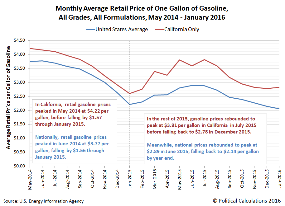
Speaking of oil and gasoline prices, we'll close with a chart showing the average retail price of all grades and all formulations of gasoline in the period from May 2014 through January 2016.
Perhaps the most remarkable thing illustrated in the charts above is that during periods of time when oil and gasoline prices fell, the first period which had a larger decline in fuel prices combined with the immediate impact of a minimum wage hike saw half the rate of improvement in new jobless claims than the period that saw oil and gasoline prices falling by a lesser amount, but no minimum wage hike.
It's just a shame that trend had to come to an end so early after the minimum wage in California was hiked on 1 January 2016.
Source: http://politicalcalculations.blogspot.com/2016/02/gasoline-prices-minimum-wage-hikes.html


