


This is Worse than Before the Last Three Crashes

by Wolf Richter, Wolf Street:
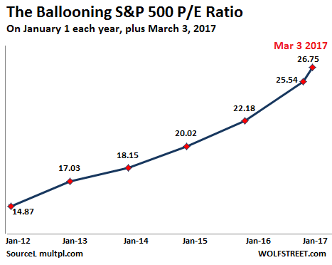
![]() This chart shows “multiple compression” is coming.
This chart shows “multiple compression” is coming.
How long can this surge in stocks go on? That’s what everyone wants to know. Projections range from “forever” – these projections have become increasingly common – to “it’s already finished.” That’s a fairly wide range.
Everyone has their own reasons for their boundless optimism or their doom-and-gloom outlooks. But there are some factors – boundless optimists should push them aside assiduously – that, from a historical point of view, would trigger tsunami sirens. Because in the end, it’s not different this time. And the cycle of “multiple expansion” and “multiple compression” is one of those factors.
For example, a stock trades at a price that gives it a P/E ratio of 20 (stock price is 20 times earnings per share). When earnings per share remain flat over time, but the stock price rises, then the P/E ratio (the multiple) expands. When this spreads across the market, even when aggregate earnings remain flat, it means “rally.”
And earnings have been flat since 2011! The other day, I posted a chart that showed that earnings of the S&P 500 companies in Q4 2016 were back where they’d been in Q4 2011. So five years of earnings stagnation. Yet, during those five years, the S&P 500 index soared 87% [read… S&P 500 Earnings Stuck at 2011 Levels, Stocks up 87% Since].
The thing that changed during those five years was the P/E ratio. This combination of flat earnings and soaring stock prices, and thus soaring P/E ratios, is, historically speaking, not a good thing when it drags on for too long. This chart shows the S&P 500 P/E ratios on every January 1 of the year. This aggregate P/E ratio has nearly doubled from 14.9 on January 1, 2012, to 26.7 on March 3, 2017:
Flat earnings, no problem. But wait… The problem for stocks is the inevitable multiple compression. Multiple expansion and compression go in cycles. Like boom and bust. Invariably!
Multiple compression with flat earnings means “sell-off.” And when this combines with an earnings decline, the sell-off turns into much worse. It happens with regularity.
This chart by John Alexander at Macro Charting tracks the percentage increase and decrease of the P/E ratios – so multiple expansion and compression – going back to 1979. I marked the four record periods of multiple expansions (in months). The first three – which ended in 1987, 2000, and 2009 – turned into periods of multiple compression associated with blistering crashes:
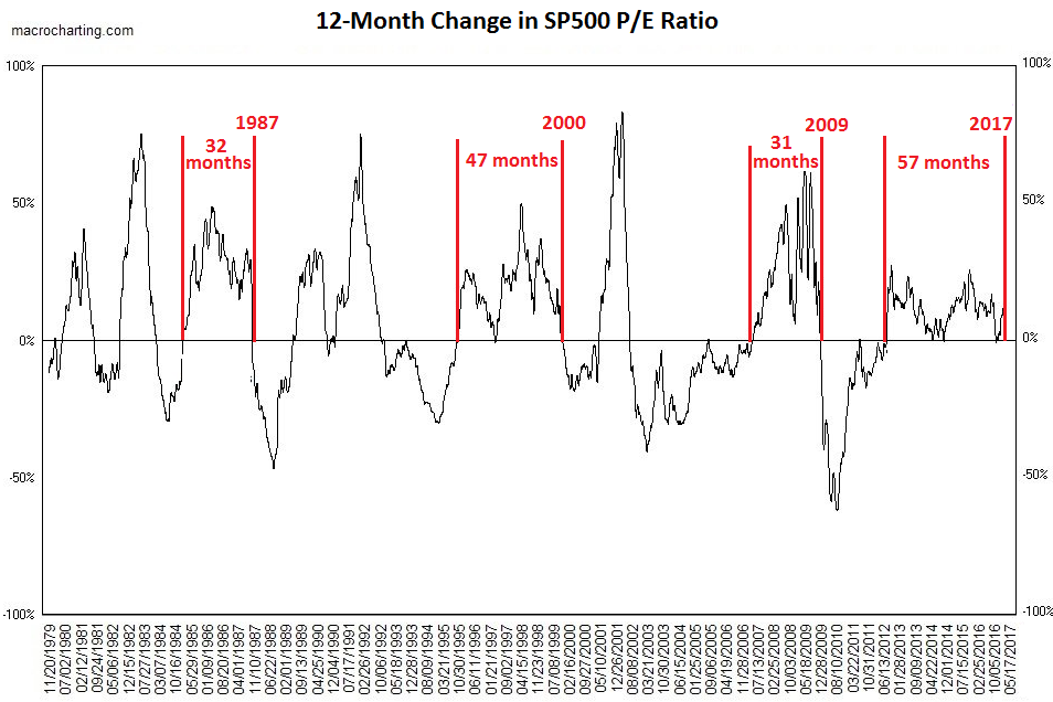
The current period of non-stop P/E ratio expansion has lasted for 57 months, by far the longest in the data series. Can this go on forever? The chart says no.
Does the chart tell us when the pendulum will swing in the other direction? Nope. In fact, the chart tells us that the pendulum should have already swung in the other direction after, say, 40 months, and that it started to do so, and then bounced off.
There are a million reasons why multiple compression hasn’t started yet, including the scorched-earth monetary policies by central banks around the world and the hope for miracles during the Trump administration.
