


| Story Views | |
| Now: | |
| Last Hour: | |
| Last 24 Hours: | |
| Total: | |
Does Quantitative Easing Really Equal Higher Stock Prices?

Quantitative Easing—Panacea or Slight of Hand?
By Van Tharp Trading Education and Training Workshops
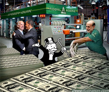
Everyone who follows the financial markets knows that in the past several weeks, central banks in Europe and the U.S. have made widely publicized moves to add liquidity to the financial markets, a move known as “quantitative easing” (QE).
In the U.S. version, the Federal Open Market Committee pledged to buy $40 billion of mortgage-backed bonds monthly, with no defined “end date” for the program. This has led pundits to dub this round of quantitative easing “QE Infinity” or “QE Eternity.”
With the backdrop of an equities bull market that has more than doubled stock prices since the market bottomed in 2009, the question on the minds of many investors and traders is, “Will QE3 add fuel to the stock market bull?”
While QE3 was designed to help reduce unemployment (based on a convoluted thought process that we’ll have to save for another day), Fed Chairman Ben Bernanke has been outspoken in his use of the stock market as a barometer for U.S. economic health. Will this new influx of money lead to higher stock prices? Let’s take a look at some data to see if we can arrive at a useful expectation.
Does Fed Easing = Higher Stock Prices?
Many pundits roll out a chart similar to the one below to show how stock prices rose as the Federal Reserve amassed assets over the past three years:
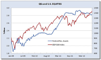
The chart is from an excellent QE3 debunking blog post by former analyst and money manager Denis Ouellet. Merely looking at this chart and jumping to the conclusion that previous QE efforts are the reason for the three-year stock market bull run is actually a logical fallacy known as “questionable cause.”
Dr. Sheldon Cooper, the fictional lead character in the hit TV show “The Big Bang Theory” (played wonderfully by actor Jim Parsons) is known for giving the Latin version of this fallacy: “Post hoc, ergo propter hoc,” which translates as, “after this, therefore because of this.” It’s also sometimes referred to as “Rooster Syndrome,” because it’s akin to believing that the sun rises because the rooster crows.
But correlation does not imply causation. The fact that two lines are heading up simultaneously doesn’t necessarily mean that the movement in one is causing movement in the other. Could there have been some other cause? What else could have driven stock prices up over the past three years? The rebound from a severe recession and debt crisis is definitely one possibility. Certainly one of the most time-honored drivers of stock price is corporate earnings, so let’s look S&P 500 price and an earnings-per-share trend for the same period:
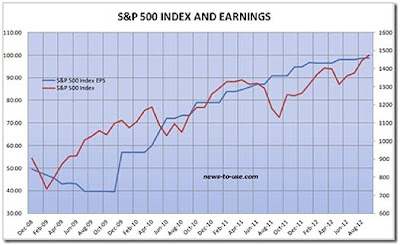
One of the pillars of fundamental analysis is that earnings drive stock prices. That being the case, this earnings chart is perhaps an even more plausible explanation for the rise in stock prices. Furthermore, most analysts would agree that the main driver for this three-year earnings improvement was prudent cost cutting, not revenue growth. In other words, QE provided little help for the revenue side of the earnings equation.
Equity Pricing and Beyond
The tendrils of quantitative easing pervade many areas of current financial debate. In our next article, we’ll further explore the earnings vs. liquidity argument and see what other areas are being affected by the massive infusions of capital.
2012-09-28 15:26:01
Source: http://invest2success.blogspot.com/2012/09/does-quantitative-easing-really-equal.html
Source:
