


| Story Views | |
| Now: | |
| Last Hour: | |
| Last 24 Hours: | |
| Total: | |
The Fruits of ‘Free Markets’ and Inequality: Female Mortality Rates In the US

Be prepared for the next great transfer of wealth. Buy physical silver and storable food.
jessescrossroadscafe.blogspot.com / By Jesse / April 6, 2013
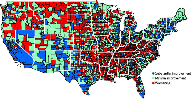
“There is a frightening graph in a recent article in Health Affairs by David Kindig and Erika Cheng. Kindig and Cheng looked at trends in male and female mortality rates from 1992–96 to 2002–06 in 3,140 US counties.
What they found was that female mortality rates increased in 42.8% of counties (male mortality rates increased in only 3.4%). The counties are mapped below: red means that female mortality worsened.
You can see a strong regional pattern: just about every county showed had worsened female mortality in several southern states, while no county showed such decline in New England. There are many questions about what explains this pattern. For example, did healthier women migrate out of the south from 1992 to 2006?
Nevertheless, the map depicts a shocking pattern of female hardship, primarily in the southeast and midwest.”
Thanks to BrotherJohnF
2013-04-07 20:47:13
Source:
