


| Visitors Now: | |
| Total Visits: | |
| Total Stories: |

| Story Views | |
| Now: | |
| Last Hour: | |
| Last 24 Hours: | |
| Total: | |
Be a SkyTruther! Follow Your Favorite Places in Google Maps/Earth
Thursday, March 31, 2011 18:21
% of readers think this story is Fact. Add your two cents.

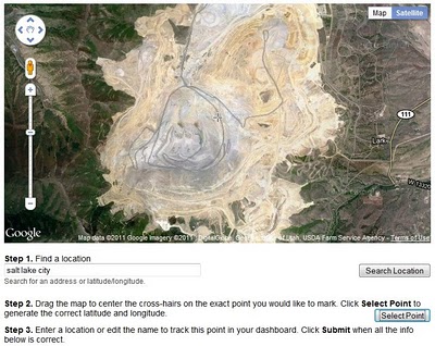
The folks at Google have released a great new tool called Follow Your World. Now you can sign up to get email alerts whenever they update the imagery in Google Maps and Google Earth covering your areas of interest. Using a simple interactive map interface, you can select and register points of interest:
I’m hoping that in the near future they’ll allow us to draw polygons on the map to define areas of interest.
What’s so great about this? Now anyone can do some armchair SkyTruthing, keeping on top of the latest free imagery from Google showing what’s happening in the places you care about most. Don’t forget about the View Historical Imagery tool in Google Earth, which allows you to toggle between images taken at different dates to see (and even measure) how a place has changed over time. See a SkyTruth example, looking at the growth of impact from tar-sands mining in Canada, and watch the video below of the shrinking Aral Sea. Then show us what you can do!
