

| Online: | |
| Visits: | |
| Stories: |

| Story Views | |
| Now: | |
| Last Hour: | |
| Last 24 Hours: | |
| Total: | |
My Super Cool Internship at SkyTruth

Hi, I’m Tom Jones! I’m a Shepherd University student majoring in environmental sustainability. I’m interning at SkyTruth this summer as part of my senior capstone project. The purpose of my research project is to map mountain removal coal-mining sites in Appalachia in order to update the database previously established in 2007, where they mapped everything from 1976 to 2005. I’ll be picking up where they left off, mapping everything from 2005 to 2010.
This time around I’ll be using a new program called Google Earth Engine (GEE), made available to us at no cost (thank you Google Earth Outreach!). In GEE you can train a classifier, which means I can train it to identify mountain top removal sites for me, without having to go through every potential mountaintop removal site in Appalachia myself! The first thing I did in GEE was to bring in Landsat satellite data, which is provided by GEE from a database of both inactive and active satellites. I’ll be using Landsat-5 Annual Greenest-Pixel TOA Reflectance Composite. This will allow me to view all of the images taken from that year as one image and I won’t have to worry about cloud obscurity. Next, I create the classes I want GEE to identify, which in my first run through, was Mining (RED), Vegetation (GREEN), and Urban (BLUE). Using the feature to add hand drawn points and polygons, I clicked on 12 sample locations for each class so that the classifier would know what colored pixels are associated with which class.
There are 10 different options for what type of classifier to run the trainer with. After some experimenting I chose Voting SVM, which chooses the value identified by the highest number of classifiers. The last thing I did before clicking the “train classifier” button was to choose a resolution of 20 meters to increase the detail of the image.
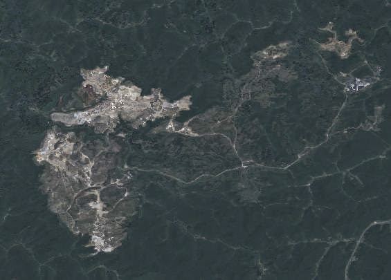 |
| Detail from Greenest Pixel Landsat-5 composite image, 2010. |
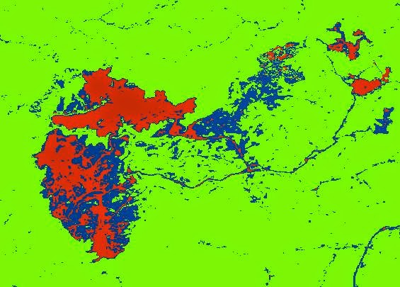 |
| Classification results for image above. Red = mined area, blue = “urban,” green = vegetation. |
As you can see above, the classifier is far from perfect, correctly classifying the brighter parts of the mine — areas of recent cut-and-fill activity – as a mine, but incorrectly identifying the darker parts as an urban area, which it clearly is not. Mines and urban areas both contain impervious surfaces, and bare rock is spectrally similar to concrete and asphalt, so it is no wonder that the classifier confused the two. All said and done, the classifier was still able to correctly classify most of the mined area under the mine class I created. In order to better analyze the accuracy of the results I needed a more detailed image, so I downloaded the classified image and brought it into QGIS to convert it from a raster, an image full of pixels, to a vector file, an image full of points and lines. The vector file allowed me to select just the mine class and bring that into Google Earth as a KML file. Then I could overlay that on the much more detailed, high-resolution imagery in Google Earth to get a better view of the area that was classified.
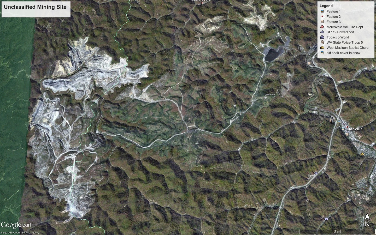 |
| Hi-resolution imagery in Google Earth for mining area shown above. |
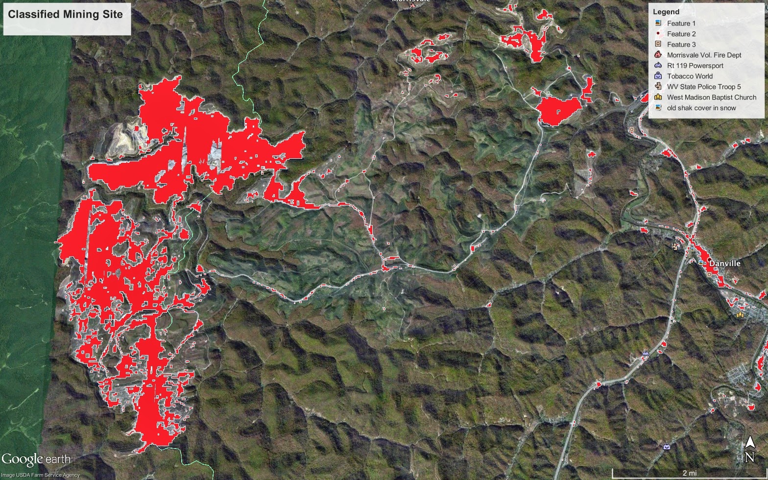 |
| Mine classification results from 2010 Landsat composite image (red) overlain on hi-resolution imagery for direct comparison and error analysis.
With Google Earth I can better see what the Landsat classifier missed. As you can see, the area that was classified as Urban (BLUE) in GEE, you can now tell that most of it is actually reclaimed land, which means, for now, they finished mining on that portion of the land and have attempted to restore it. Since I’d like to be able to identify both the active and reclaimed portions of the mine, on my next training of the classifier I will remove the urban class and add in the reclaimed mine class. Instead of placing my points for the new blue class on urban areas I will place them on areas at the mine that appear to be reclaimed. Through this methodology I hope to obtain more accurate results. |
Source: http://blog.skytruth.org/2014/07/my-super-cool-internship-at-skytruth.html
