
| Visitors Now: | |
| Total Visits: | |
| Total Stories: |

| Story Views | |
| Now: | |
| Last Hour: | |
| Last 24 Hours: | |
| Total: | |
Roger Andrews: So How Much Warming Was There In New Zealand Anyway?
So How Much Warming Was There In New Zealand Anyway?
by Roger Andrews
 While discussions in the recent NIWA post concentrated on the legal aspects of the NIWA vs. New Zealand Climate Science Coalition (NZCSC for short) proceedings I was looking into this question. Was it indeed as much as 0.91C/century, as NIWA claims?
Or only 0.34C/century, as NZCSC claims?
Or was it somewhere in between the two?
To investigate the issue I constructed two surface air temperature series from scratch using twelve New Zealand GHCN v2 records. These series act as robust checks on the NZCSC and NIWA series for the following reasons:
The data sets are different. The raw data used by NZCSC and NIWA come from over 30 separate records that NZCSC and NIWA composite into single records at seven stations. But only five of these stations (Auckland, Wellington, Hokitika, Dunedin and Nelson) are listed in GHCN and therefore included in the twelve-station GHCN v2 data set I use, and seven of the GHCN stations I use (Christchurch, Invercargill, New Plymouth, Kaitaia, Gisborne, Napier and Whenuapai) are omitted from the NIWA data set. As a result there is only an approximate one-third overlap between the two data sets and the data are not always the same where they do overlap.
The analytical approaches are different: NZCSC and NIWA apply stair-step adjustments to the 30 separate NIWA records – NZCSC using the Rhoades-Salinger method and NIWA a method apparently of its own devising – before averaging the seven composite records to obtain time series. The twelve GHCN v2 records I use are already merged (by GHCN), and other than reduction to a common baseline and rejection of bad or suspect data I apply no adjustments to them.
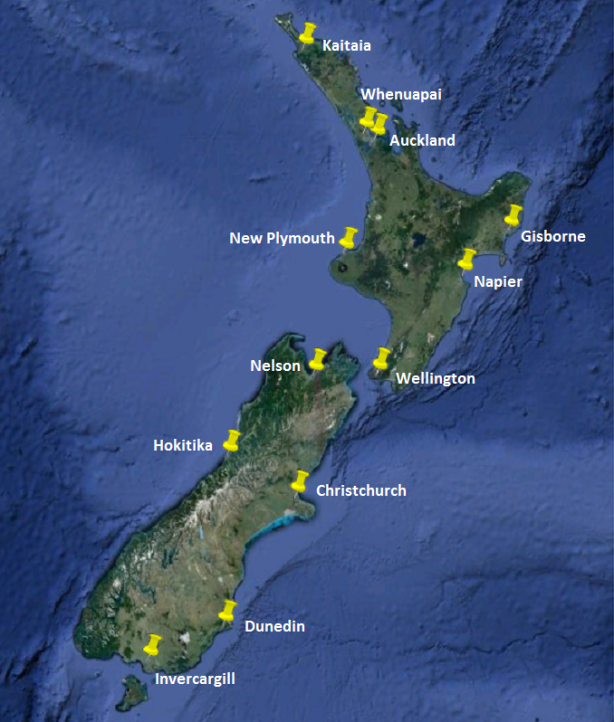
GHCN v2 lists a total of eighteen records in New Zealand. Five of them (Auckland, Albert Park, Auckland Albert Park, Christchurch New Zealand and Dunedin Aerodrome) are too short to be of any use and the two records at Whenuapai can be combined into one, leaving twelve records containing a total of 846 years of readings since 1881, and these are the records I used. The locations of the corresponding twelve stations are shown below:
I first constructed a baseline-adjusted series from the twelve GHCN v2 records with temperatures expressed as anomalies relative to 1950-80 averages. Before constructing it I deleted the following bad or suspect record segments:
- Wellington before 1929 (large stair-step discontinuity)
- Hokitika before 1913 (large stair-step discontinuity)
- Dunedin before 1914 (record implausible)
- Gisborne after 1995 (anomalous warming)
Here is how the twelve records compare after the deletions:
The generally good overall match indicates that none of the records is seriously distorted over the long-term by artificial discontinuities, UHI gradients etc. and it also shows that the records don’t need homogenization (they are in fact already more homogeneous than the GISS “homogeneity-adjusted” versions). I therefore used the annual averages (red line, two-station minimum) as my baseline-adjusted series.
Next I constructed a first-difference series using the same GHCN v2 data. The graph below compares this series with the baseline-adjusted series. There are only minor differences:
So how do these two series compare with the NIWA and NZCSC series? The next graph plots all four of them together between 1909 and 2009, the period covered by the NIWA and NZCSC series –
– and it’s difficult to see what’s going on because the short-term temperature fluctuations obscure the long-term trends. So at the risk of incurring the wrath of statistical purists here are the data replotted as ten-year running means instead of annual means:
Now we can see that the NZCSC, baseline-adjusted and first-difference series show a respectable match but that the NIWA series is way out in left field. This result effectively validates the NZCSC series (within limits) and falsifies the NIWA series.
Having established that we can now address the question of how much warming there has been in New Zealand over the 100-year period between 1909 and 2009. Making an exact estimate is problematic because of the large short-term fluctuations in annual mean temperatures, but we can come up with an approximate estimate based on regression line gradients, which for the ten-year means plotted on the graph above are NZCSC = 0.45C, baseline-adjusted = 0.52C and first-difference = 0.49C, and for the annual means shown on the graph before that are NZCSC = 0.34C (the value quoted by NZCSC in its report), baseline-adjusted = 0.44C and first-difference = 0.43C. The mean of these values is 0.45C and the standard deviation is 0.06C, so I’m going to say that 0.45 +/- 0.12C of total warming over the last 100 years is as good an estimate for New Zealand as we are going to get.
The NIWA series shows about twice as much warming as the other three series and it’s now obvious that the extra warming is manufactured. And to see how it’s manufactured we need only look at the warming adjustments NIWA applies to its raw records (all estimated to the nearest 0.01C, incidentally):
An argument can in fact be made that if adjustments this large are needed to make the raw records “correct” then the raw records were far too heavily distorted to have been used to begin with.
2012-11-01 05:15:13
Source:


