
| Visitors Now: | |
| Total Visits: | |
| Total Stories: |

| Story Views | |
| Now: | |
| Last Hour: | |
| Last 24 Hours: | |
| Total: | |
New U.S. Climate Map Shows Temperature Changes In HD. How To Prepare?

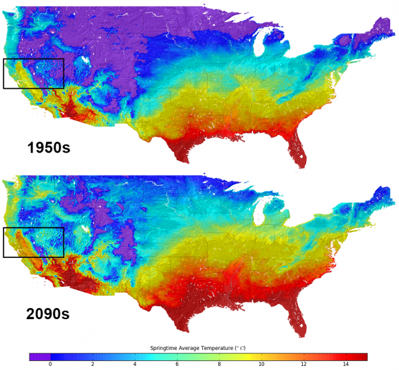
Average temperatures in the United States. Top, what they were in the 1950s. Bottom, the predictions for the 2090s. Credit: NASA
If you’re interested to see how warm your neighborhood will look like at 2090, here’s a chance. There’s new data available that has monthly climate projections for the continental United States at the size of a neighborhood, or about a half-mile (800 meters).
Readers who have moderate to advanced knowledge of how to manipulate datasets can see instructions for how to get the raw information here. As for everyone else, NASA briefly summarized how the information could be used for community planners to deal with the effects of climate change.
(…)
Read the rest of New U.S. Climate Map Shows Temperature Changes In HD. How To Prepare? (323 words)
© Elizabeth Howell for Universe Today, 2013. |
Permalink |
No comment |
Post tags:
Feed enhanced by Better Feed from Ozh
Source: http://www.universetoday.com/104908/new-u-s-climate-map-shows-temperature-changes-in-hd-how-to-prepare/


